INTRODUCTION
DataBeacon is Accenture Client Suite Application Product for its various Diamond Clients. It is sold as an SaaS to companies which are having issues in accessing Data across their organisation.
THE CHALLENGES
Data Beacon already had a responsive App, but the entire user experience was frustrating and confusing, product looked mere prototype with many visual inconsistencies. It was as if the contents were strewn without proper thoughts.
My job was to redefine the user experience, simplify the data access flow, and to create a new visual language that could work.
THE KICKOFF
I started by looking into the old UI, And see into how the requirements can be shaped into an application which can be easily used by any user. We started to have the plan for project in place by making a quick paced process.
By looking into the old UI and new requirements, we decided to go with LEAN UX process
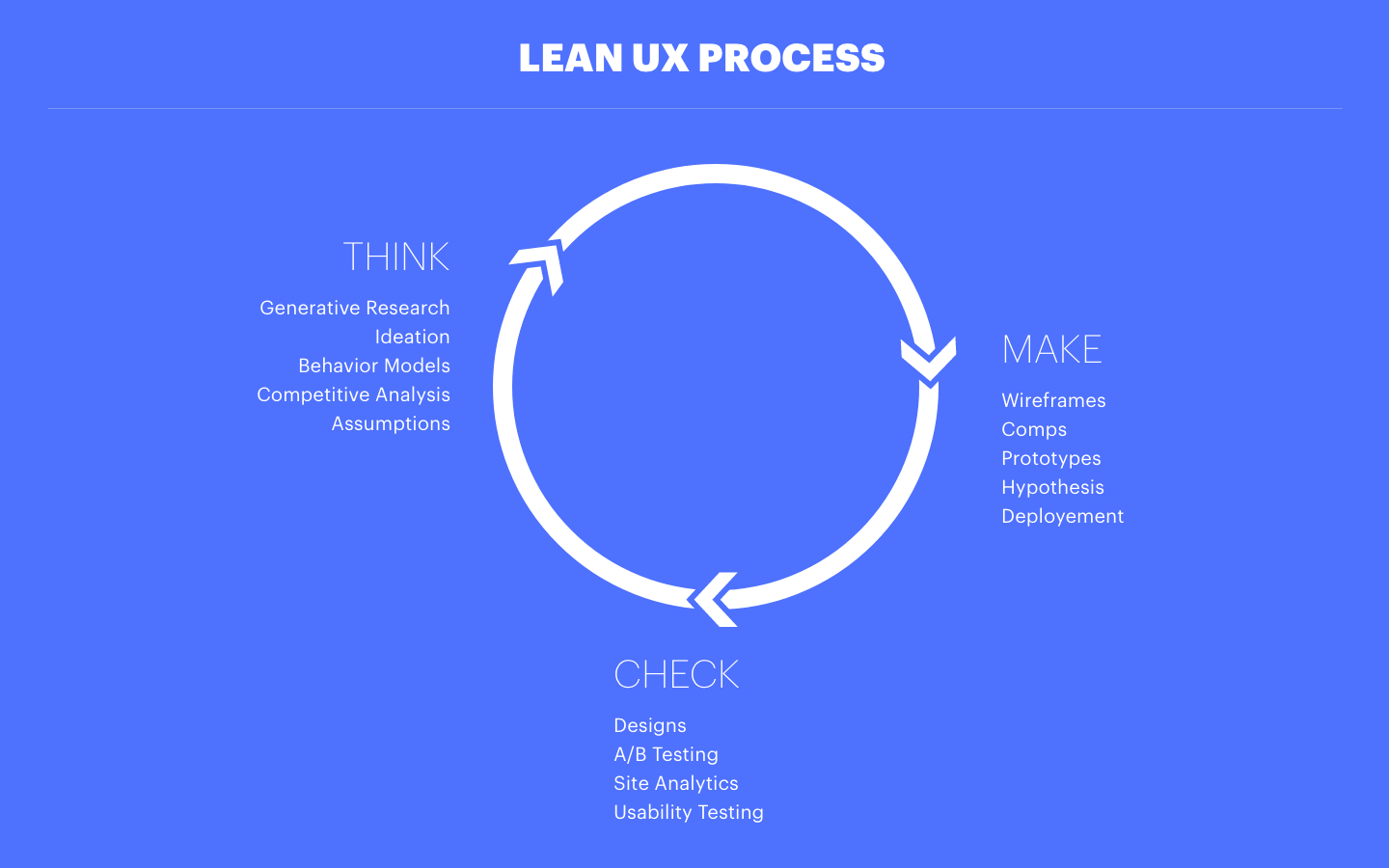
RESEARCH
Research process involved Competitive Analysis and also conducting User Testing on existing portal with Users. Have created multiple behaviour models and Assumptions out of the research deliverables.
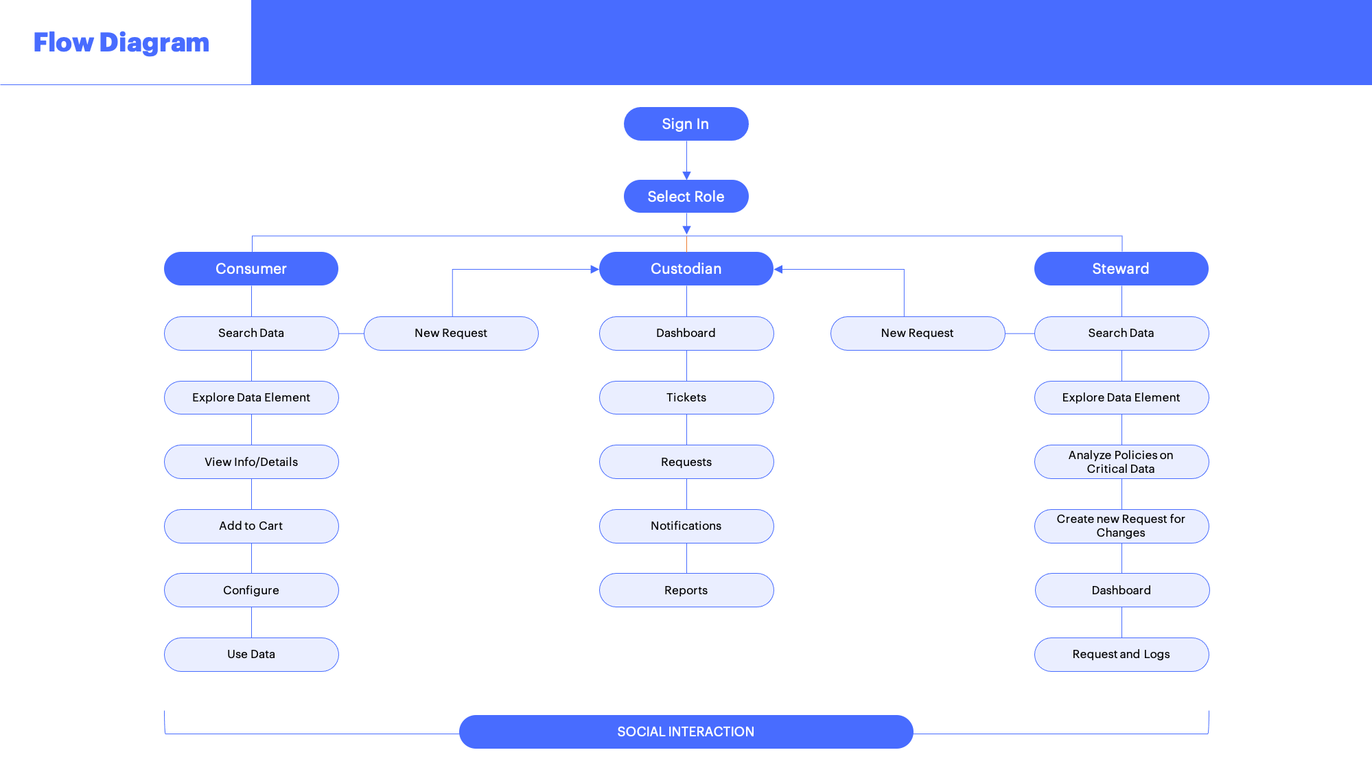
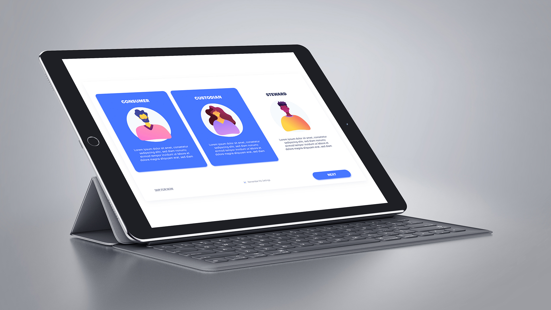
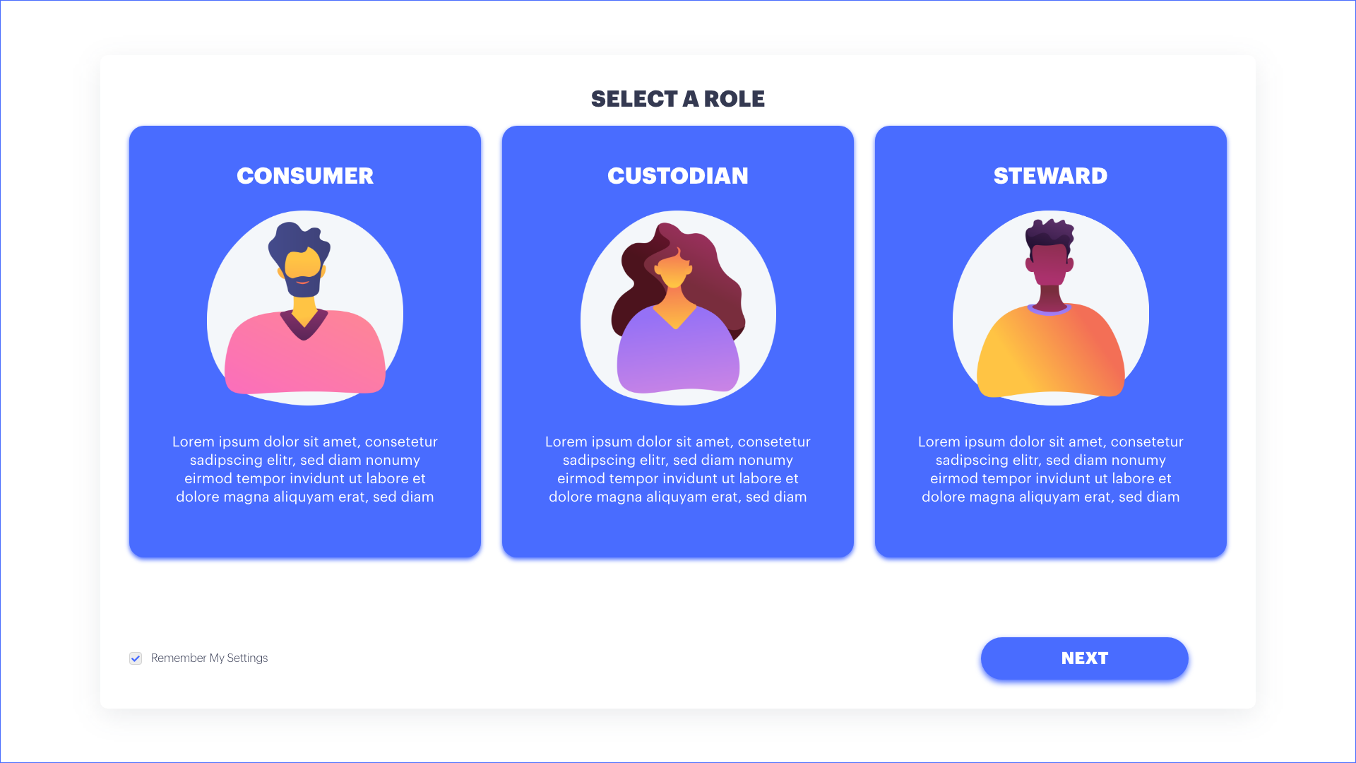
Using the research material and assumptions, have divided portal as per User Roles and functionalities.

Each role has an independent functions to perform on the portal,
but main aim of the portal is to " Discover Data - Access Data - Use Data"
WIREFRAMES
Using old UI and user stories from research process as base, designed very low fidelity wireframes digitally. All wireframes are designed digitally to later be converted into quick visual design screens. This process was iterative, which went through various levels of approvals.

DESIGN
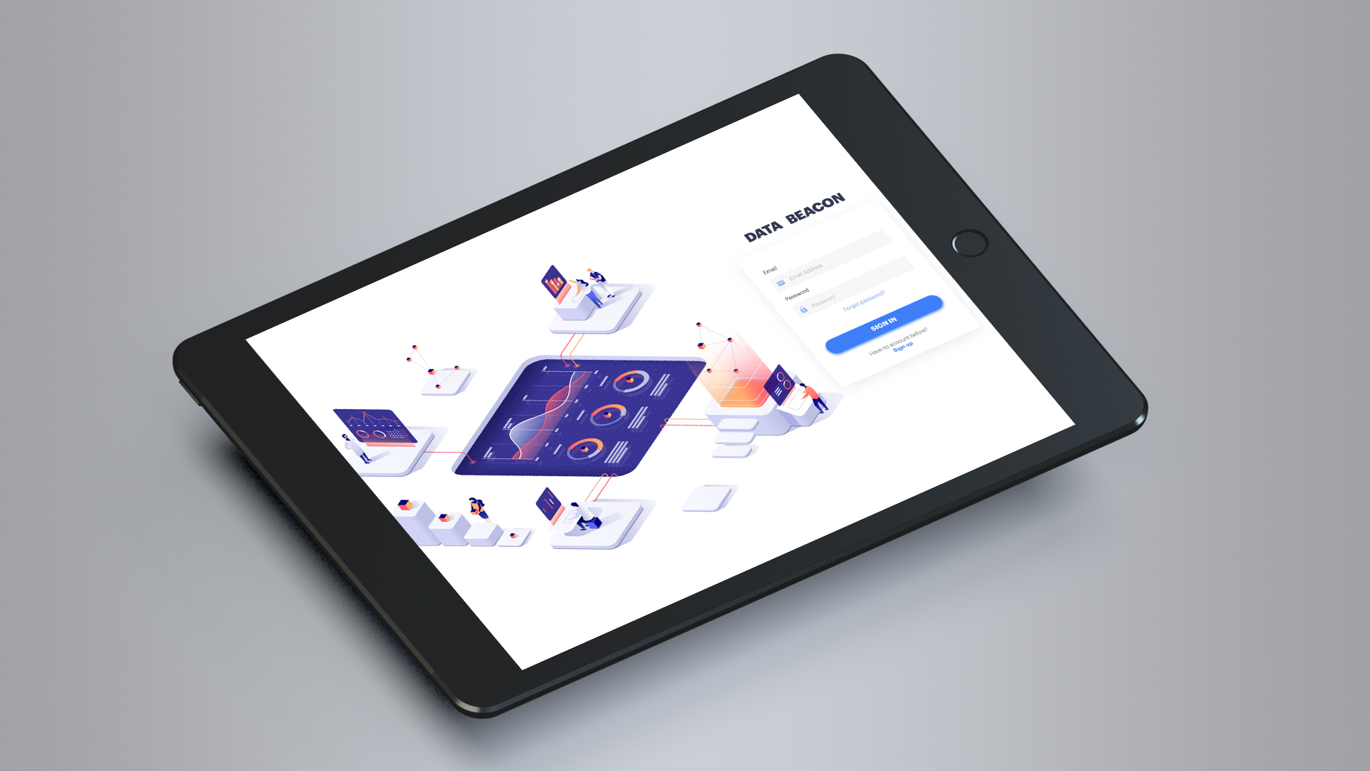
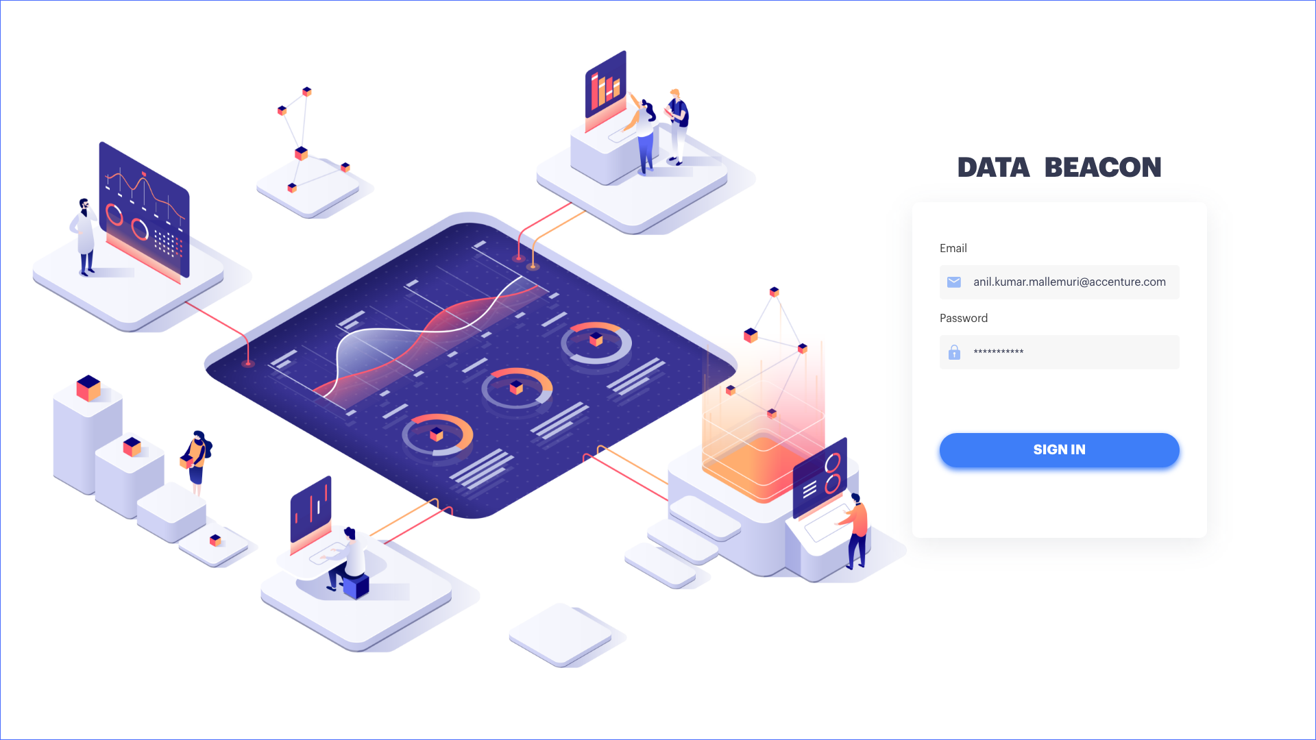
The UI has to be very neutral without having any branding guideline, as the product is going to be given to multiple clients. I aimed toward a clean and minimal design, dropping all the odd colors, and design elements that were used in previous app. I used the colors which are more towards trending style. Created isometric and vector based artwork. Discoverability and a clear visual distinction between the contents were my primary focuses.
I used Wireframes as a playground to explore the right Visual Language.
NEXT STEPS
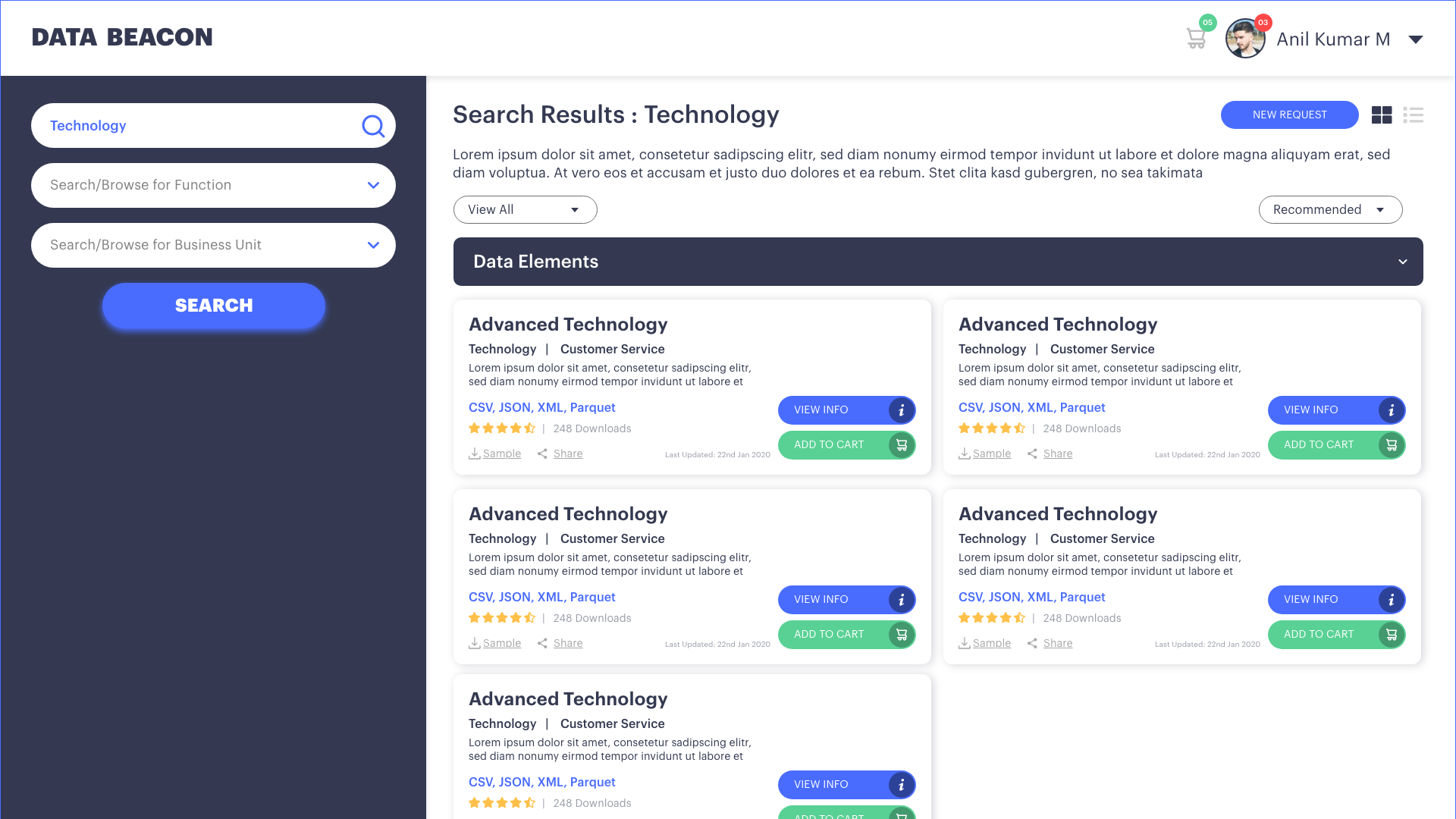
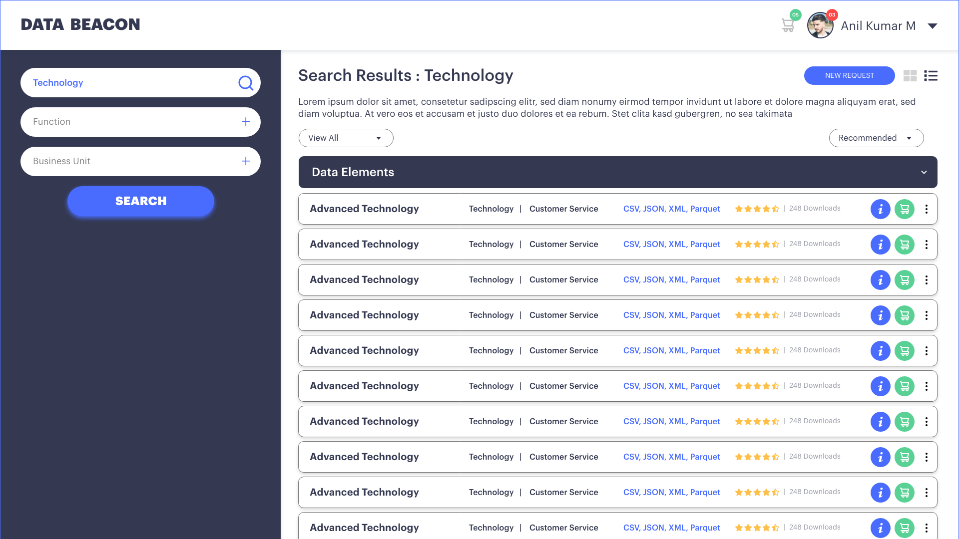
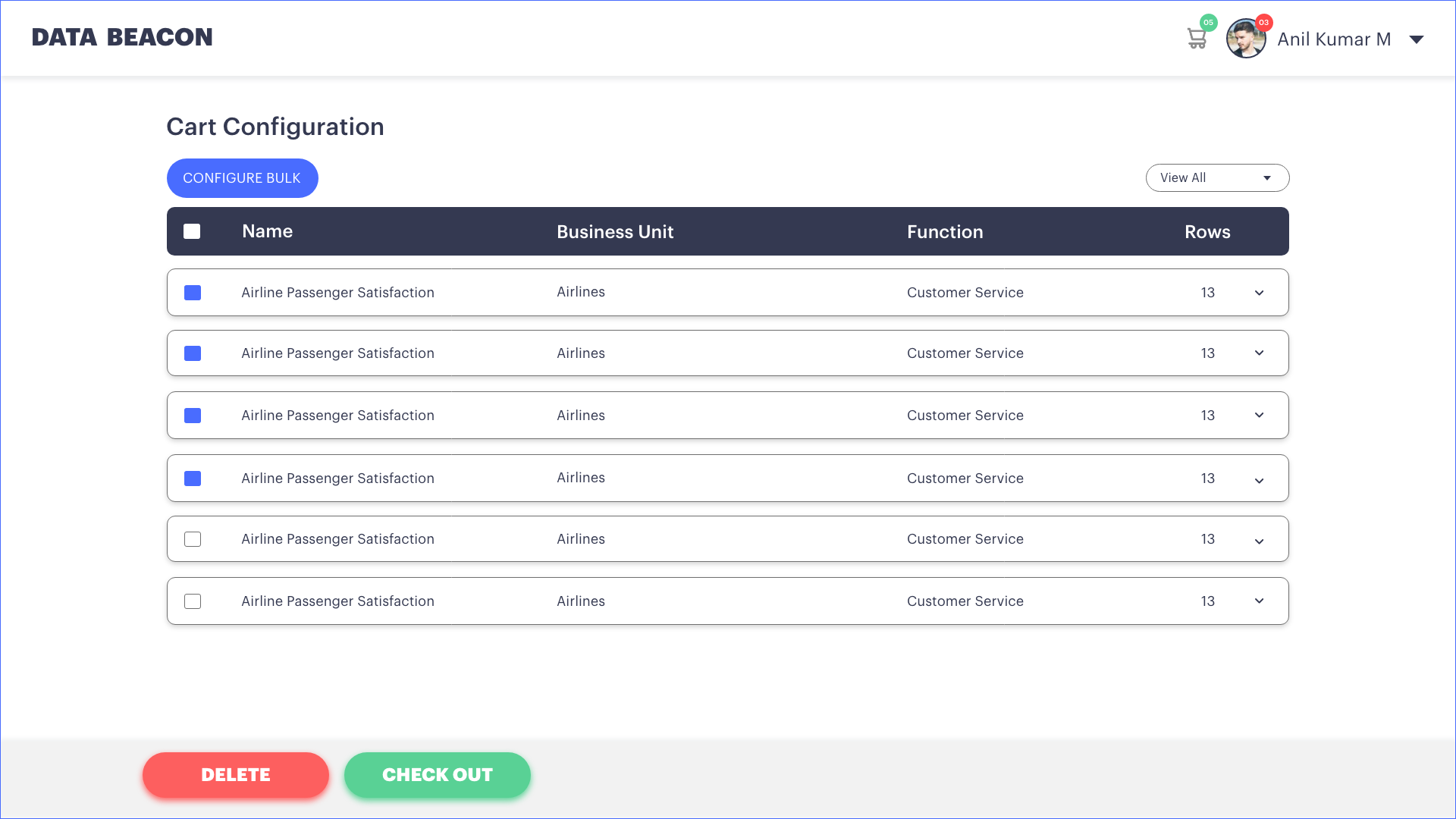
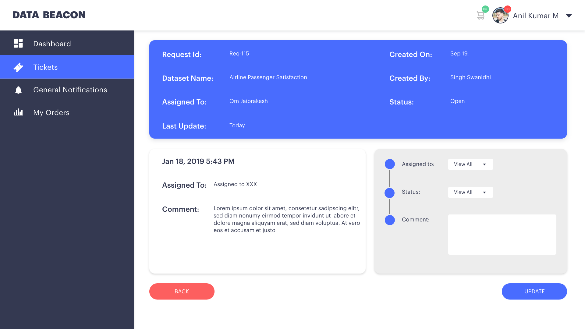
Having tested the both design options for A/B Testing, we inclined more towards the clean and trendy UI Design. Using this as base, have split our design tasks as sprints and started designing each module one by one. Here are some of the design screens with comparison with older version of the product.
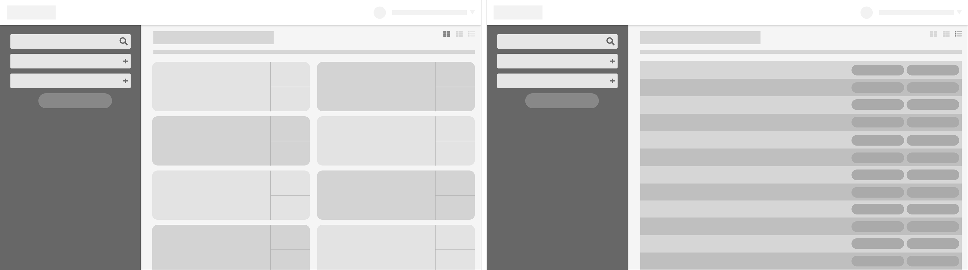
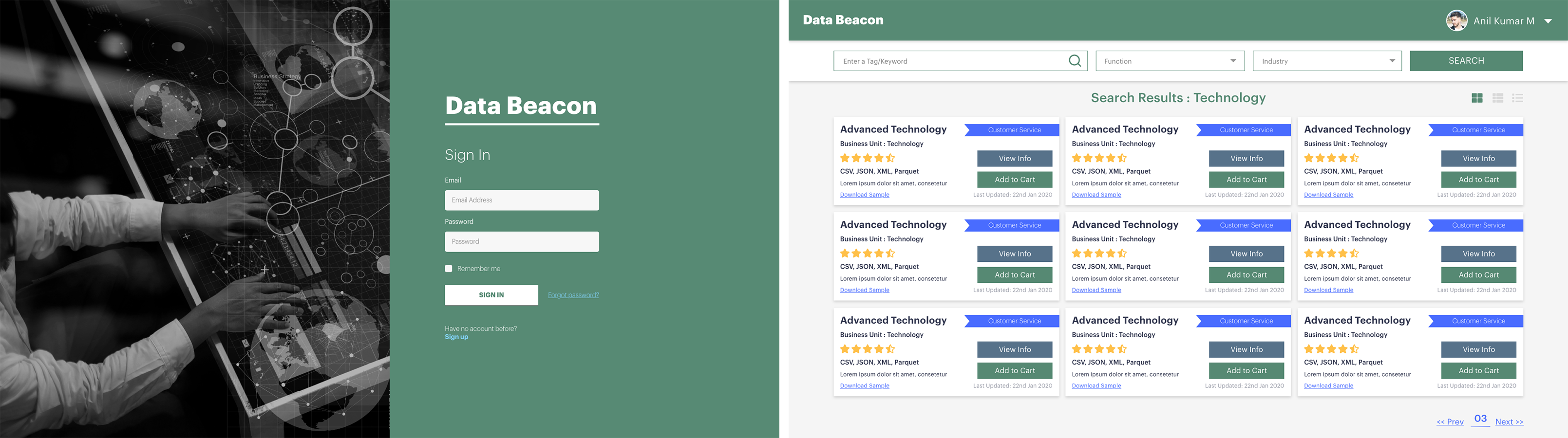
OLD UI SCREENS
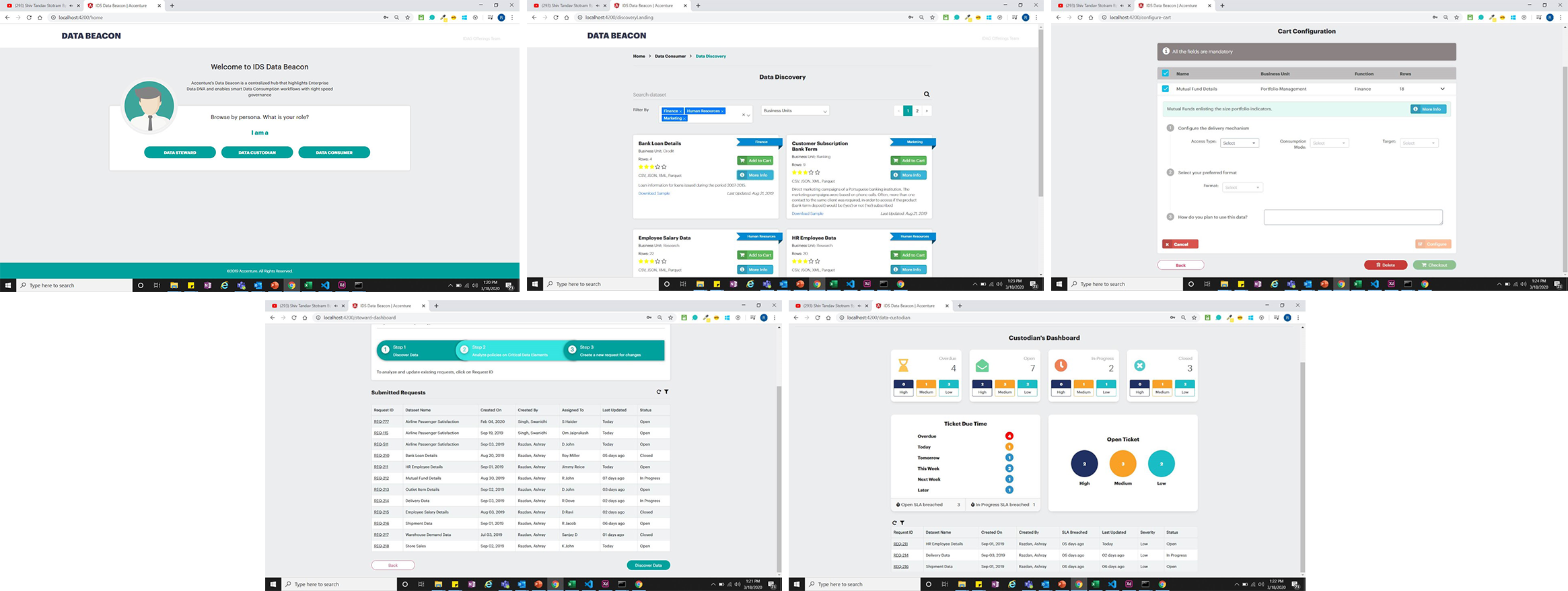
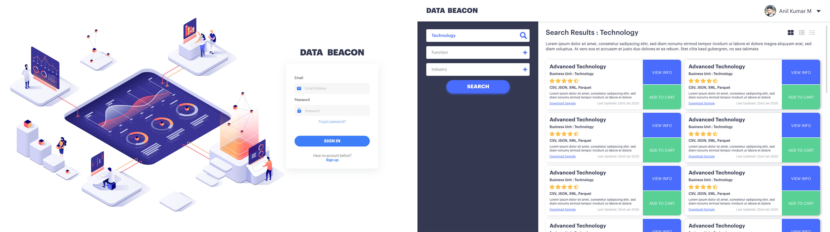
NEW SCREEN DESIGNS


Click the link to explore the interactive prototype of DataBeacon
Successfully designed the App within a record timeline of 4 Weeks. Out in market with almost 15,000 companies as effective customers to Accenture.